
|
|

"The
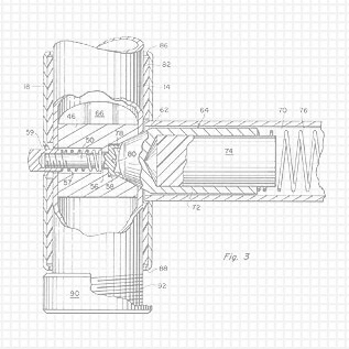
grid background conveys that our inventions have been engineered to
a level well beyond the concept stage". |
Web Design: an Industrial Design perspective The professional Industrial Design disciplines of human engineering, aesthetics, graphic design and corporate / product identity have been applied to products by Industrial Designers for so long that we sometimes forget that they also have application within more recent technologies. Industrial Designers are typically associated with the design of three-dimensional products, environments and equipment. Many of those products include a "user-to-product" interface, i.e. controls, displays, or instructional graphics. Whether it is the handle of a hammer or the cockpit of a jet airliner, there are points of contact that connect the user to a product. For many instruments this interface is a two-dimensional control panel for which we as designers are also responsible. A website is in essence, a control panel that one interacts with in order to display various fields of visual information and audio-visual media. The same design disciplines of human engineering and aesthetics, i.e. visibility, and intuitively organized graphics and controls apply in exactly the same way to website usability. As Industrial Designers, we coordinate a product's "informational architecture" to assure an intuitive and "user-friendly" experience. The internet is a relatively new environment that is still actively evolving. Like the design of most products, its functionality will improve over time with standardization and the introduction of universally accepted design practices. We look forward to a day when all websites offer intuitive navigation, and when the use of special effects and trendy graphics do not interfere with simple functionality.
We have no illusions that the design challenges presented by this site are not nearly as complex as other sites requiring e-commerce functionality for example. And, there is no need at this point for "Search" or other text fields. This site will evolve over time and we may add more sophisticated features when justified such as video for certain product demonstrations. For now a simple online brochure is all that is needed. The entire design is original, and not from a template, including the "vertical navigation/banner, backgrounds, favicons, logos etc.
As with the design of any website, the first order of business should be to communicate to the viewer what we do, and if necessary, what we don't do, as quickly as possible. Fore-thought Designs™.com's basic goal is to showcase pre-designed inventions that are available directly from us for licensing to manufacturers. It might seem at first that this is all we need to say on the homepage. But, the homepage of any site should anticipate the questions a viewer may have when having been directed to your site by a search engine. Practically no one searching the term "inventions" for example is a manufacturer looking for new products to license. Much as we wish it were otherwise, they are far more likely to be other inventors looking for companies to represent them and their inventions to industry. We certainly don't want them to send us anything confidential mistaking us for such companies. And, most results from searching the term "design" would involve design consulting services. Anticipating such examples we have designed our "homepage" to quickly convey a summary of our business strategy in order to eliminate any confusion and wasted time.
This page serves as both the "book cover" and "Table of Contents” for our site. Though it is not necessarily the page we would email to a targeted recipient, for others surfing the web or typing in the "URL" indicated on a business card, it is intended to convey what we are, and what we are not, ASAP. Otherwise, they may have to read more than they care to, just to get the gist of our site before returning to their search. The "Welcome" greeting immediately identifies this as the "homepage" and introduces the sites navigational format. An image link displaying an unusual looking new product is designed to spark curiosity, and prompt them to explore the "Featured Inventions" further. The purple text tells them that the picture is a functional link to related information as it does for other images throughout the site.
The Fore-thought Designs™ logo: Since we read text from left-to-right, and top-to-bottom, the logo's placement in the top left corner suggests a point of origin for the sites content. The word "FORE-THOUGHT" is hyphenated to emphasize its use as an adjective, as opposed to a noun. It conveys the "pre-designed" status of our inventions. The word "DESIGNS" emphasizes the plurality of available inventions as opposed to the singular noun "Design" usually associated with a design service.
"Invest in solutions". The motto helps differentiate us from the design consultants they are likely to encounter when searching terms such as "design", "inventions" or "product development". But, more importantly, it reinforces the key advantage that we offer; i.e. the risk-free opportunity to view and consider the results of our product development initiative and investment.
The "vertical navigation/banner" integrates both the navigation bar typically seen on the left of most sites with the identity graphics typically displayed in a horizontal banner across the top of the page. This vertical banner format maximizes the vertical space available to its right for large images and text and minimizes vertical scrolling. It visually separates the static (navigation buttons) and general information (quotes and page-related abstract concepts) on the left, from dynamic content and specific subject matter on the right. This theme also provides page-to-page continuity. The specific information on the right can also be viewed more easily on smaller screens. All pages are sized to accommodate our target audience; industrial manufactures, using 19-inch screens set to 1024 x 768 or larger resolutions". We make it easy for the viewer to understand what type of content we offer, and how to get around the site. An update notice on the homepage let's them know that new content has been added since their last visit. Clicking on the "SiteMap" link takes them to a page that shows the organizational structure of the entire site. The map, accessible from any page, includes functional page links that change color to indicate visited vs. unvisited status, so that they may track pages they have seen and access any page directly. A vertical page link arrangement was chosen to more intuitively relate the navigation buttons to their associated content. Again the format follows the left-to-right, and top-to-bottom theme. It resembles a "table of contents" more than the "organizational chart" style seen in many other websites. Since each page title occupies screen space horizontally, this format makes it possible to view the entire map without scrolling.
Images and graphic icons on most pages help communicate what the text is about before it is read. Quotes or captions under those icons summarize the text content on that page or adjacent paragraph. The text is presented with readable fonts and sizes. Column widths are sized to let the reader visually stay on track as they scan from the end of one line to the start of the next.
Images are used throughout as large link buttons to allow less precise mouse coordination. "Alternate text" flags appear when “mousing over” those pictures telling visitors in advance where the link goes, or imparting additional information about the image The content for each subject is presented in a sequence ranging from "general information", to "specific details", so that the reader only reads to the extent of their own personal interest. Like the homepage, the initial link is in a general context and serves as a "table on contents" from which the reader can access progressively more detailed information. The "Contact us" button opens a page that indicates in advance that the site will launch their email program. Otherwise inadvertently launching that program could be an irritant to online visitors. It also provides us an opportunity to remind them of what to include, or not include in their message, and allows them to save a copy of their message for themselves. -Steven Tidcomb, Designer and founder of Forethought Designs.com. |
“The homepage serves
as the "book cover" and "Table of Contents, so that
web surfers can get the gist of our content quickly".
Click on picture to see page.
|
" Whether it is the handle of a hammer or the cockpit of a jet airliner, there are points of contact that connect the user to a product." |
"As with the design of any website, the first order of business should be to communicate to the viewer what we do, and if necessary, what we don't do, as quickly as possible". |
"Images and graphic icons on most pages help communicate what the text is about before it is read". |
The "Contact us" button opens a page that indicates in advance that the site will launch their email program. It also provides us an opportunity to remind them of what to include, or not include in their message. |
INVENTIONS FOR LICENSE |
Invest in solutions. |
Fore-thought Designs™ logo. |